Monday 19 November 2012

The best of the Christmas catalogues...

Ah it's been a while and apologies for that - time has mostly been spent wedding planning and getting married. Back to normal now and a nice easy one to get me back into it...

You may have noticed that Christmas is nearly upon us and whilst the Santa's Grottos have been set up since September in some shops, the high street and eCommerce world have really stepped it up a notch in the last couple of weeks. And so I thought I would sift through the many mini-catalogues that have come with my various magazine subscriptions and pick out my favourite items to share with you.


1. Bodie and Fou's New-York Wall Light - Black & Copper 
I love this design - pure and simple lines, chic and effortless. This would look as good in an industrial style kitchen as it would in a modern living room. Use a pair as bedside table lights or just one over a desk.

2. The White Company's Tuscany Velvet Cushions 


Cushions can often make a place looked a bit cluttered, especially when they're full of pattern. These have a beautiful texture which creates interest with just one hue.

3. Anthropologie Pie Crust Dinnerware
So many interesting objects of desire in Anthropologies Christmas catalogue but whilst we're on the subject of texture, their Pie Crust tableware collection is so gorgeous I could never get bored of looking at it. I have one plate in grey at home on the wall but would love a whole set in white once the kitchen is complete.

4. Toast's Festoon Lights
Such a change from the traditional fairy lights - they'd look great as garden lights all year round but I'm not sure how resilient they would be against the British weather.

5. Notonthehighstreet.com's Personalised Feather Baubles


My husband and I have always bought each other a special bauble every Christmas so that when we're old we will have a tree filled with memories. These personalised baubles from NOTHS are simple and elegant, one would be lovely but so would a family set!

Until next time x

Sunday 24 June 2012

Afraid of the dark? Don't be!

OMG it's been such a long time. Wedding planning, course work and 9-5 have been taking up far too much time lately! Anyway, today's post is inspired by Kelly Hoppen's latest creation for Yoo - Barkli Virgin House in Moscow. The queen of taupe has honoured her love of neutral hues but with a twist; the main colour in much of the space is black.


Images - Facebook.com/KellyHoppen


When researching for this post I came across the following quote:


"A light colour will never come to life in a dark room but a rich, deep colour can make a dim, somber space feel warm and luminous – even though it receives no natural light." Donald Kaufman


This is so true! There is such a misconception that a dark colour will make the room feel small and dingy, but if the room lacks natural light a light colour will only enhance the shadows. Plus a room is the size it is no matter what colour the walls are so if it is small then dark walls will make it even cosier.


Dinginess is avoided through finishings and accessories, here are some tips on how to make dark walls work:


1) choose a silk finish paint- this will reflect the light off the walls making the room feel less enclosed


2) Light coloured furniture and soft furnishings will add contrast and depth


3) reflective accessories such as glazed ceramics, glass and chrome will keep the light around the room


4) break up large blocks of colour. A large blank wall is a waste of useable space at the best of times but in a dark hue it could feel quite over-bearing. Break the space up with pictures, plates, shelves - anything!


If in doubt, why not experiment in the hallway - whist you will pass through it multiple times a day, you won't spend long periods of time there so it is a great place to try out colours to see how you feel about them in your life.


Until next time!


(and hopefully it won't be so long) x

Sunday 8 April 2012

Completed projects: Adding colour

I hope you are enjoying your Easter. Apologies it has been so long since my last post, life has gotten in the way of blogging. Saying this, I have still been keeping my toe in the Interior Design water - below are pictures of two completed projects, the dining room and kitchen of my friend Lucy and her husband, who asked me to help them add colour to the rooms.

Their dining room was the main place for entertaining guests, they wanted it to feel welcoming and cheerful with a colour that went with the oak furniture that they already had, they also needed a colour that would compliment a print they have from San Francisco. I suggested a teal palette, using two tones of the same hue to break up the room, make the most of the natural light source from the large patio doors, and to highlight the period features. I also suggested black curtains, which tied the warm tones of the furniture and cool wall colour together. Below are the before and after pictures, the wall colour is Dulux Winter Teal.

Before - plain walls
After - the lighter teal is used on walls that received the most amount of natural light

After - decorative alcoves are highlighted through two-tones of colour

After - the colour compliments the San Fran print

Their kitchen was refurbished with the rest of the house, it was lovely and new but just needed a bit of colour, and a means of covering up some damage from damp that occurred after the refurbishment. The colour scheme needed to compliment the wooden cabinets and dark worktop and floor tiles they already had so I went for splashes of vibrant complementary colours - amethyst and lime green, toned down with the addition of a light grey. I suggested a repetitive tile pattern using the metro style tiles with a base of white, which not only helped to add the colour subtly, but also kept the project within budget! The blind includes all the colours of the tiles and ties the scheme together.

Before

After - the kitchen now has more life to it with matching tiles and blind

After - repetitive tile pattern

After - still a large amount of white used, to add balance to the room
I have some other projects that are close to completion so I will being updating you soon.


Friday 2 March 2012

A closer look at Conran funiture designs for M&S

Terence Conran's furniture range for Marks & Spencers concentrates on simple but classic pieces in colours that will stand the test of time.

There are two themes that I especially love about this range; firstly the use of contrasting materials for funtional parts to create an edge with everyday objects. 


Webster Dining Table has striking red metal rod supports


Brindley Coffee Table features leather straps

Wilkins Storage Chest with firehose handles

Secondly is the way that retro pieces that are pretty much extinct in the modern home, have been given a stylish modern make-over.


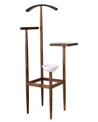
Dawkins valet is unrecognisable from its stuffy original form

Cayley Drinks Trolley - more Mandarin Mimosa than Tom Collins!
 View the whole range here.

Until next time x
Friday 3 February 2012

Creating a Modern Retro look

Belated happy new year! Unintentionally I had a blogging break in January, to work on coursework and projects for friends.

Anyway I'm back now and extremely happy that so is my favourite TV programme - Mad Men.


Like many people, I am in love with this stylish show and still find it fascinating how authentic the set and the cast look to the retro era in which it is set.

I am hoping to re-decorate our living room/den at some point this year, and I would love it to have a retro theme. Here is what it may look like:
1. Diamantini & Domeniconi Snap Clock (nest.co.uk); 2. London table lamp (Grahamandgreen.co.uk); 3. Pottinger + Cole Checkpoint Mirror (nest.co.uk); 4. Knoll Florence Knoll cabinet (nest.co.uk); 5. Forte Table (made.com); 6. Quentin Armchair (made.com); 7. Neilsen 3 seater sofa (made.com)

Whilst there are lots of places to buy vintage furniture, you can create a vintage look with a modern feel through new pieces available. It comes down to choosing the right shape and colours. Danish furniture was a popular choice in the 50s and 60s with its simple yet functional and comfortable designs, and the influence is still strong in some modern ranges. Teak was the wood of choice and moss green, navy blue, warm browns and mustard yellow were a popular palette for colour.

Once you've achived this, kick-back and enjoy an Old Fashioned... Don Draper style!