Monday 25 April 2011

Exterior improvements

For the last couple of weekends my boyfriend and I have been decorating (although I prefer the term "transforming"!) the exterior of our flat. This is before:

 
Firstly we painted the front of the house. Unfortunately our budget wouldn't stretch to rendering the window ledge or reshaping the mouldings, but a splash of paint did wonders.

Chosing a colour was a decision that took a while. I wanted a colour that was unique but at the same time, wouldn't stick out like a sore thumb. We spent a long time walking around the local area and taking in the colours our neighbours had used on their houses. We found that there were very few brightly coloured houses, and white or magnolia appeared to be the colour of choice. We decided on Dulux Clouded Pearl 01.

There are a couple of things we learned during this process. The first thing is that you are not limited to the exterior paints that are on the shelf at DIY stores. Dulux can mix any of their colours, as well as match any that you find elsewhere.

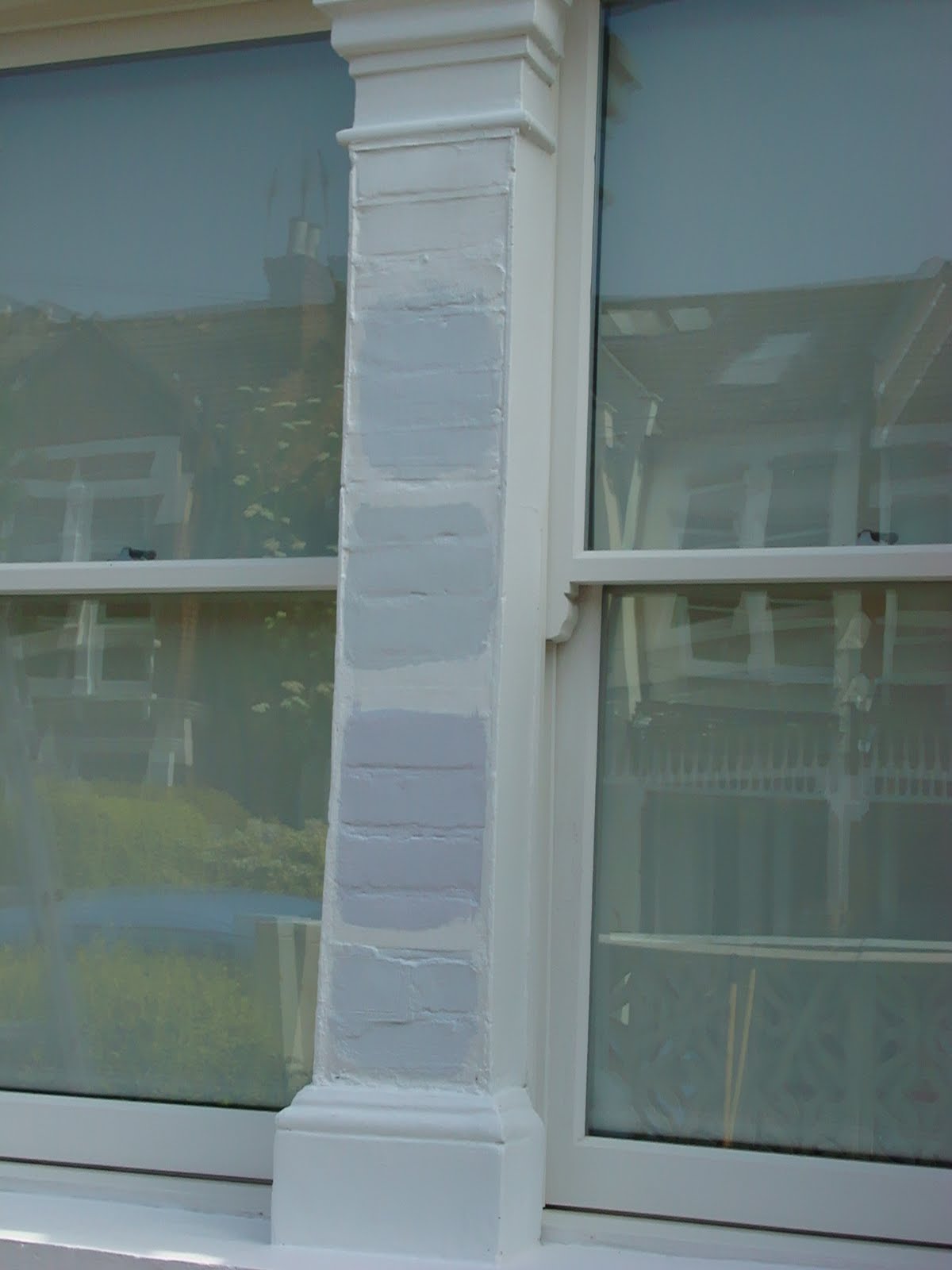
Secondly, always get sample pots. Just like interior paint, the paint on the charts differs once on the wall. We picked a few colours, painted two coats and checked them at different times of the day (when the wall was in shade and in direct sunlight).


After this was the front wall; the owners before us had added some cut out blocks on to the original wall and as fashionable as this may have been at the time, it was looking very dated and untidy.
An old image from Google street view as I forgot to take a before pic
And so we (well my boyfriend provided the muscle) knocked it down and painted the original wall to match the house.

Finally, we dug up the concrete paving slabs to add more attractive features. I am not the most green-fingered of people, so we were looking at low maintenance decor. And decided on slate and pebbles for the coverage and a monochromatic colour scheme in the window boxes.

Here is the final product, we are very pleased with the results, it is now finished to the same standard as the interior - all this in two weekends!


Next is the front door - hmmm, what colour do we go for?

Sunday 24 April 2011

Modern mouldings

The River Island store on Oxford Street has an imaginative display of plaster ceiling roses:

I love this modern twist on the use of a ceiling rose, although the traditional use is still impressive:
Image via dpmouldings

I am a big fan of the way plaster mouldings can transform a room, creating instant sophistication.
Image via lionheartdesign
Image via hellolovelythings
 And whilst mouldings are usually found in traditional room designs, painting them a different colour to the wall will create a modern look:


Image via sophisticating

Image via mydeco
There are also other less traditional ways to use plaster mouldings. Such as to frame your favourite wall art:
Image via mydeco
Or to add a sense of grandeur to your bed:
Image via dailyexpress
And finally, my favourite is this room, where plaster corbels have been used to create a modern mantelpiece:

Image via housetohome

Monday 18 April 2011

Life in colour - spring time!


I love this photo - taken at a park near Buckingham Palace; it makes me feel happy and optimistic - just the way spring should make you feel!

Friday 15 April 2011

Life in colour - Kylie at the O2

Kylie was brilliant and the set was fantastic - apologies for the blurred photography but this doesn't take away from the vibrant colours!

Monday 11 April 2011

Some considerations for kitchen design

I am in the process of designing our kitchen. This is quite a big job as it involves extending to the back and a complete re-arrangement of the dining area. I am very excited about it, even though it is unlikely to happen for at least another 18 months. Anyway, whilst still in early stages, I thought it would be worth sharing with you some considerations that I have made, as well as showcase some inspirational kitchen ideas.

Layout
Although we are extending to make our kitchen bigger, the final design will still be considered small (it is a shoebox at the moment!). Therefore a functional layout is imperative. I have focused my layout around two rules  - 1) Accessibility is key. My food and condiments will be close to the oven, and my crockery and pans, near to the dishwasher and sink. And 2) the famous "kitchen triangle". The sink, cooker and fridge are the most frequently used appliances in the kitchen, to ensure maximum productivity, keep these three appliances in easy reach of one another, working most effectively when they are in a triangle.
Storage
There are so many space saving solutions around kitchen storage - from hanging utensils...

from www.housetohome.co.uk/

From www.housetohome.co.uk/

...to making the most out of your cupboard doors...
From www.housetohome.co.uk/

...to clever cupboards
From www.housetohome.co.uk/

From www.housetohome.co.uk/

Lighting
I am a fan of the simple down lighters in a kitchen – nice and clean, especially if there is limited natural lighting. Although I have more imaginative ideas for the dining part of the room.
Worktop and floor lighting are a good way to create ambience.

From http://homeklondike.com

And if you have pretty crockery that you are proud of, lighting up a glass fronted cupboard is a great way to exhibit them.
From www.stark-projects.co.uk/
Colour
Colour is such a personal choice, and there are so many ways to bring it into your kitchen. If you know you will be renting out or selling your place in the not too distant future, it might be wise to stick to neutral colours for the main surfaces (cupboards, worktops, floor). But this doesn't have to be boring...
From www.housetohome.co.uk/
...and you can always add colourful personal touches through the accessories.
Le Creuset on http://www.johnlewis.com/

Otherwise – you can go mad! Here are some gorgeous colourful kitchens...
From www.housetohome.co.uk/


From www.housetohome.co.uk/

From http://bijoukaleidoscope.blogspot.com


Friday 8 April 2011

And whilst we're on the subject of musicals....

Another film I watched recently was The Wizard of Oz. This was one of my favourite movies as a child, and watching it again reminded me why I loved it so much.

Dorothy is catapulted from her sepia existence to a world that is so busy with colour that it looks good enough to eat! She may not be in Kansas anymore but are there hints of Oz in London?

Look at these houses on Portobello road - they would certainly kill any witch they land on.
Picture from http://cuboidal.org
Follow the yellow brick road in Hyde Park?
Picture from http://londonhotelsinsight.com

The Hammersmith bridge wouldn't look out of place in the Emerald City.

Picture from http://en.wikipedia.org


Sunday 3 April 2011

The Rocky Horror Picture Show - It's not just about the songs...

Don't judge me but I love musicals and a recent viewing of the Rocky Horror Picture Show made me appreciate it on another level. Yes the soundtrack is amazing and the costumes are brilliantly outrageous, but this time around I was really taken by the set design.

Firstly there is the outside of Frankenstein Palace - a grand, eerie mansion, a typical setting of a classic horror film.

The lobby of the palace is dingy but defintely a fixer-upper; plus animal heads have made a comeback, you just have to look in Graham & Green to see that.
They've gone for the shabby chic look in the Time Warp room - look at the mouldings on the doors, and the tatty ruched ceiling lights are great!
My favourite room has to the the lab. Dr. Frank-N-Furter's green scrubs are a stark contrast to the pink tiled walls and red accents. This monochromatic colour scheme is dramatic and loud - much like the movie!

The art deco lift is very cool, what a way to enter and exit a room (a corset and suspenders help too!).