Monday 29 August 2011

Berry nice colours


Mmmmm berries! Not just tasty with ice cream but I also love the colours. I have noticed that these delicious purple and red hues are a common theme in the high street fashion stores this Autumn/Winter, but as well as in the wardrobe I think they are great in the home.

Paints on the market

Some home accessories

What I love about these colours is the fact that they can be versatile depending on how they are used.

Adding warmth...
...through purple tones on the walls and soft furnishings

...through mixing with dark wood

...through luxurious fabrics in berry colours
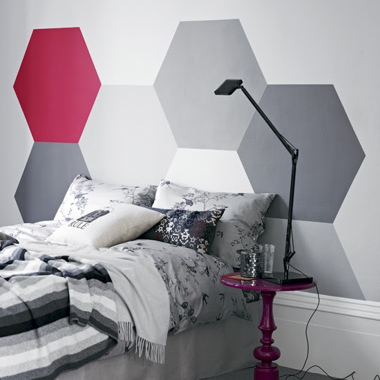
Or, by mixing berry coloured accessories with white or pale grey you can create a freshness to a room...


Aside from the ones above (all from House to Home) I haven't seen an ambundance of berriness in the interiors market just yet. However, warm or fresh, I think the berry palette is a trend that we will be seeing in the not so distant future....

Saturday 13 August 2011

Building obsession: Michelin House

London is a city full of beautiful architecture. Ever since I was really young riding around London in the car with my dad, there have always been certain buildings and structures that have really captured my interest because of their beauty. Michelin House is one of them.


Located in Chelsea, London, Michelin House was commissioned by the Michelin brothers in 1909 and designed by one of their employees - François Espinasse, for their British headquarters, it is a great example of Art Deco architecture. It was bought in 1985 by Sir Terrance Conran and Paul Hamlyn.

More information can be found on the Bibendum website - here. Bibendum is the real name of the brand trademark, more commonly known as "Michelin Man".

Monday 8 August 2011

Dining in style

The dining room is a room that has been a common theme for me this month. I have helped one friend make the most of her conservatory-come-dining room; am in the process of helping another friend add colour to her dining room. In addition to this, I am designing a dining room in the style of Philippe Starck for my course (photos of all of the above to follow); and I am also still in the (long) process of designing my kitchen-dinner for when we get our extension.

I must confess that I have never given that much thought to the dining room, as an owner of a small flat, to dedicate one room to eating and entertaining is too much of a luxury. However, during my research, I have been insipred by the ones below (all from House to Home).
Eclectic dinning room with a mish mash of colours and types of chairs

Pretty in pink
  
I LOVE the way the wallpaper continues on the ceiling - very brave!

Two-tone green and turquoise works surprisingly well

Dramatic dark blue is softened by the pink flowers
Whilst I love these colourful rooms, the ideas I have for our extension, will mean a more simple palette for a calm effect, more similar to the images below.

The floor to ceiling glass doors make the garden almost part of this room

Simple monochromatic palette brought to life with patterned textiles and chairs

A simple bench set-up is made more interesting with an unusual arrangement of paper lanterns

This is gorgeous - black bentwood chairs and large glass doors in black aluminium - makes me swoon!